Designing a universal payment experience.
My Role:
Product Designer, UI Designer
Tools Used:
Figma

01 / Problem
Design mobile pay now and pay later flows for Railsr’s customer-facing design kit
As part of Railsr’s credit card as a service (CCAS) product, they offered a design kit of pre-approved designs ready to be embedded in the customer’s existing brand ecosystem. These white-label design flows and components would be built into SDK’s for speedy and integration of CCAS features.
02 / Process
I worked with a team to deconstruct standard in-app flows and iterate on how to differentiate our product.
Too slow, cluttered screens, maze-like-feeling
We started by brainstorming problems we faced with the existing make-a-payment experience.
Identifying pain points
We researched industry standard card flows, and attributed our pain points to specific parts of the user journey.
Creating an outline
Working with legal, we created a list of required features and disclosures, then began to allocate them to specific screens with pain-points in mind.
Designing wireframes and applying branding
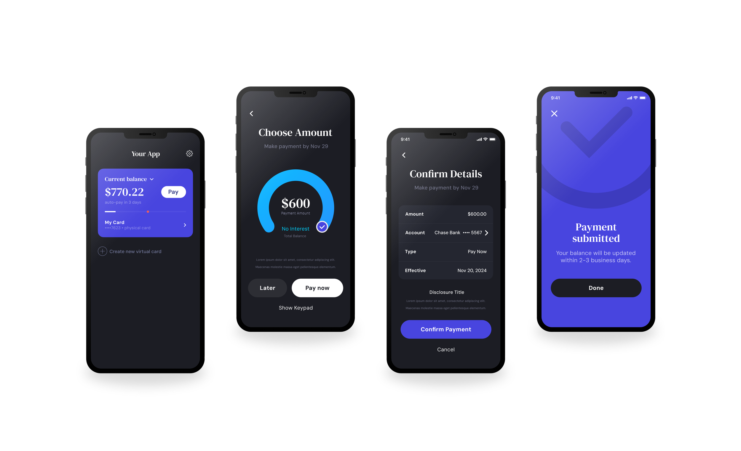
For each screen, I designed low fidelity wireframes to get approval on the UI. Once approved, I added the design kit’s branding.
03 / Solution
We minimized the user-journey, and created an engaging way to pay.
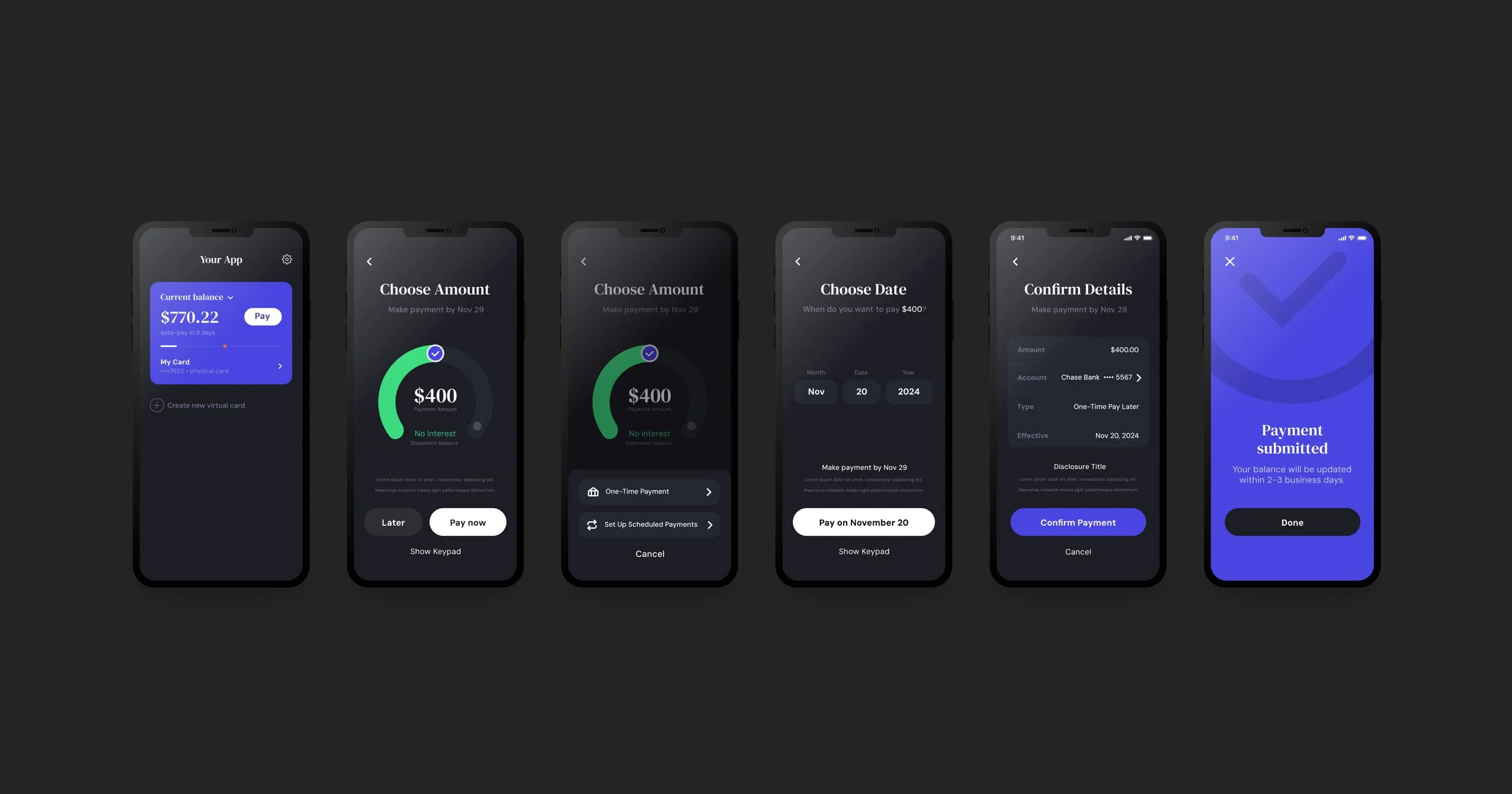
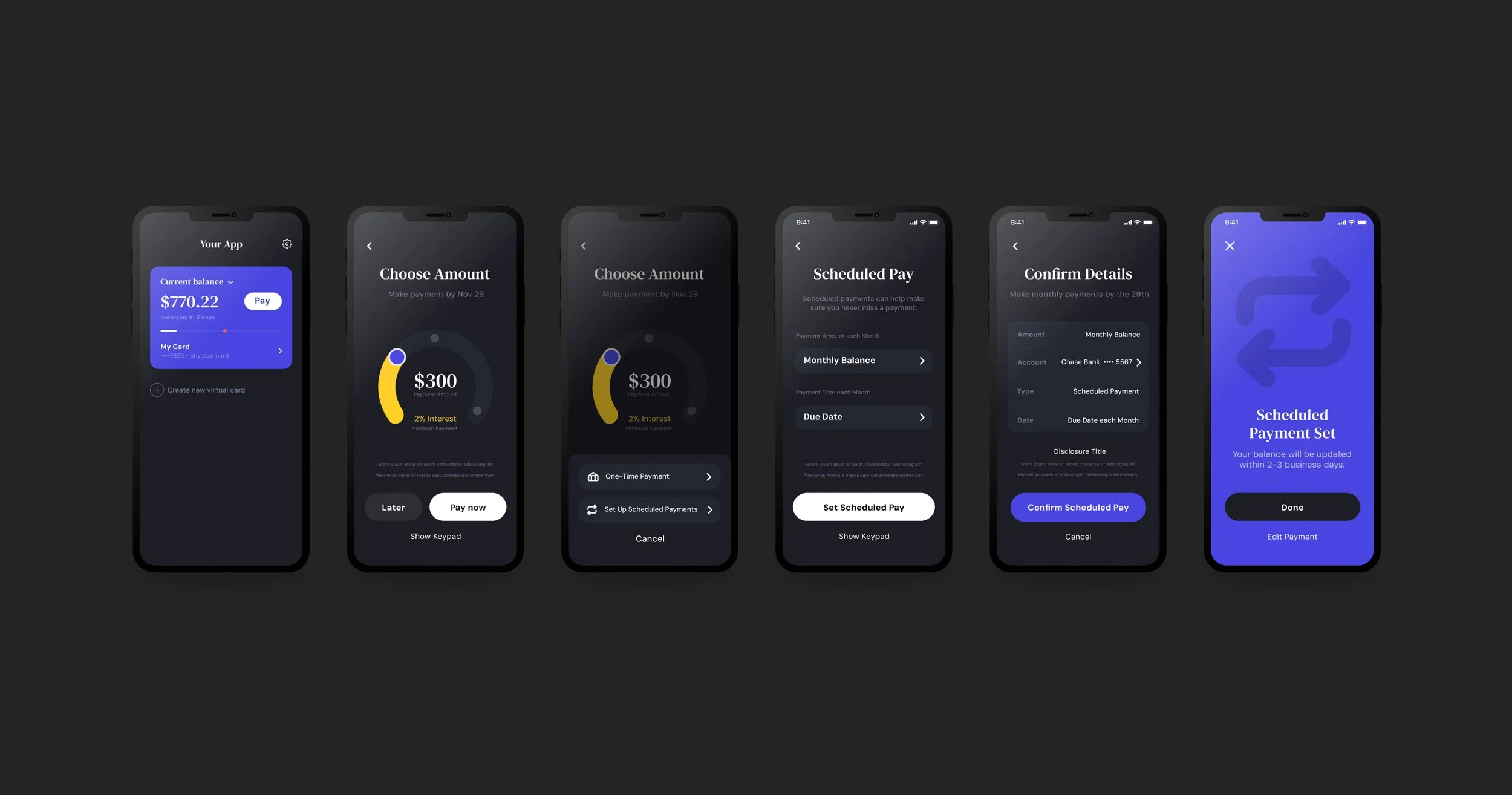
We reconstructed the traditional user journey by consolidating different forms of payments (Pay Now, Scheduled One Time payment, and Set up Recurring payment) into a single “Pay” user journey. Then I designed
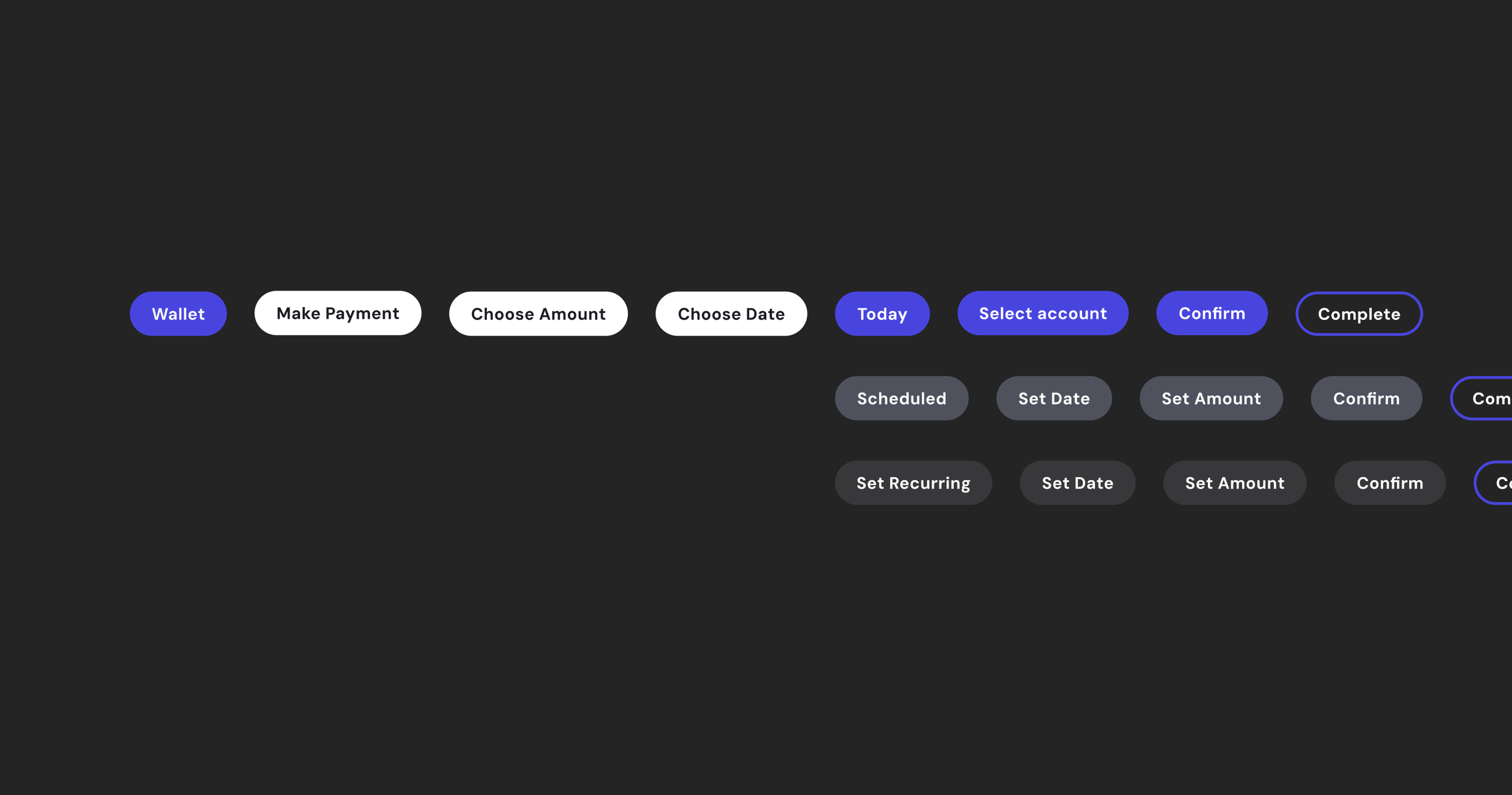
Traditional User Journey
Based on our research, we made it easier and faster to reach different payment types, instead of creating a long, meandering, user flow. We wanted to reduce the amount of screens it took to get to navigate different use cases.

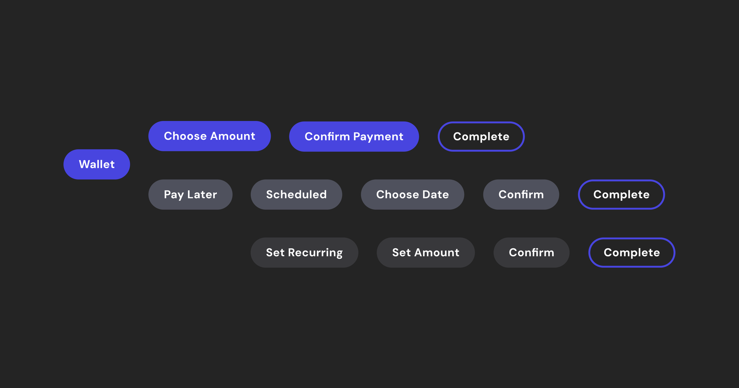
Our User Journey
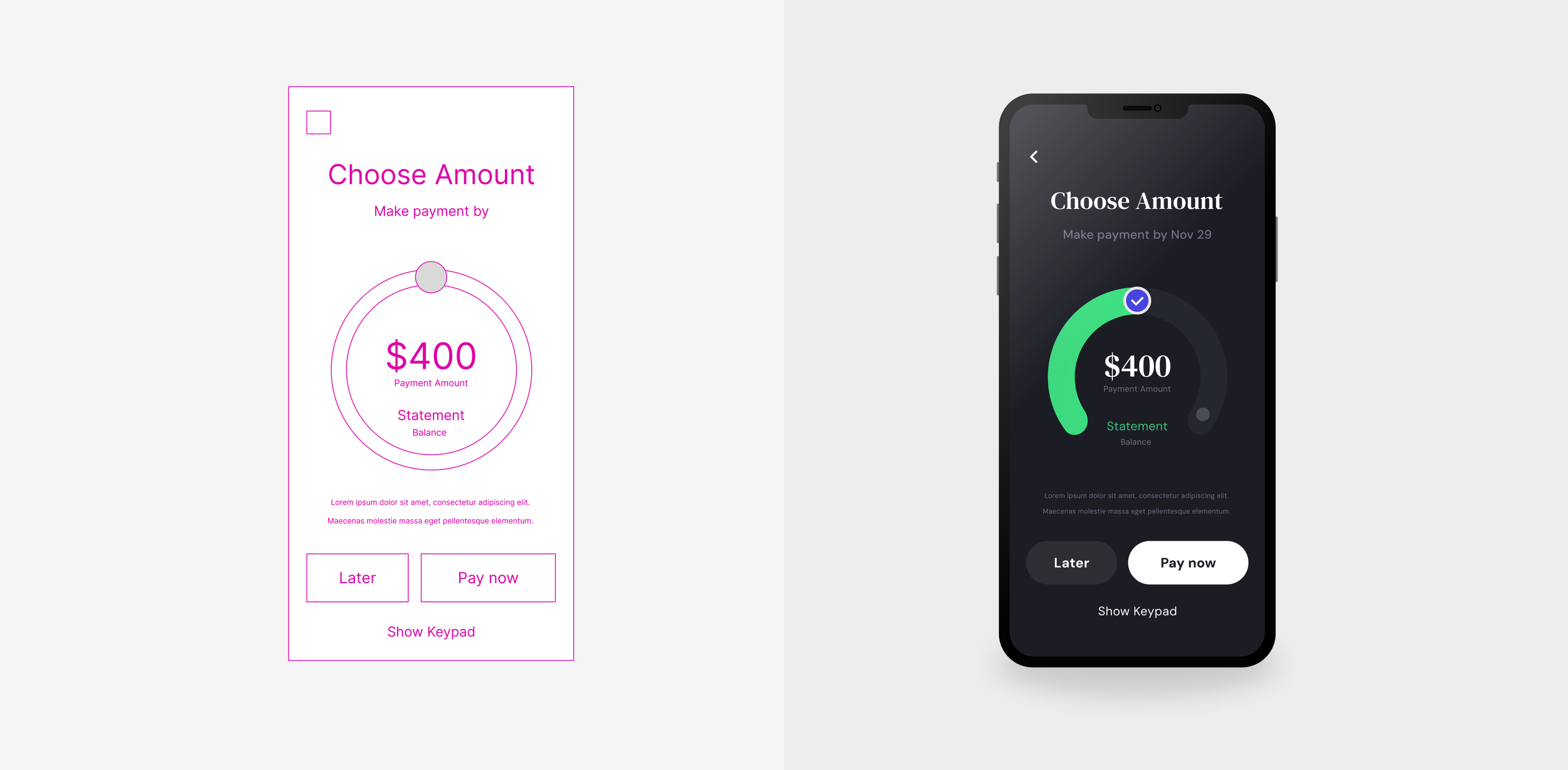
Starting in the wallet module, a ‘Pay’ button would take you to the “Choose amount” screen, incentivizing the user to pay with a colorful flywheel. At the bottom of the screen, the “Pay Later” button would give you an option to choose from the less frequently used options, either a scheduled-one-time payment or set-up a recurring payment.
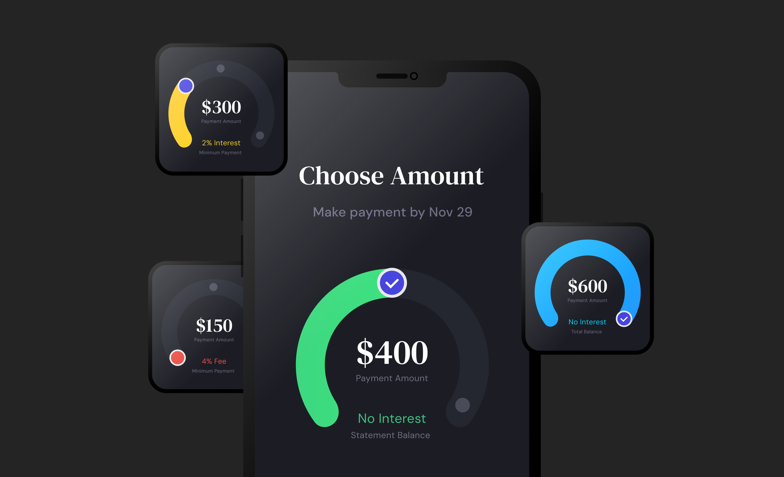
Flywheel
I designed a colorful flywheel to direct engagement towards financial responsibility with the use of color. Different pins on the wheel informed the user about payment amounts, like Minimum Payment, Statement Balance, and Total Balance.
Creating a horseshoe around informative text like “interest” and the “payment title” allowed me to draw more attention to essential text, while giving more white-space to the prominently displayed payment amount.
For accessibility reasons, I added a “show keypad” button at the bottom of the screen for traditional text input.


